You’ve used the right Facebook cover photo size, and everything looks perfect on your laptop. Then you check the same cover on your phone and half the headline is gone.
That’s because dimensions are only part of getting a Facebook cover photo right.
Facebook displays and crops your cover differently depending on the screen, so you need to think about what stays visible, where you place important text or logos, and what you actually want people to notice when they land on your Page.
Here’s how to design a Facebook cover that looks good where it matters, whether someone finds you on desktop or their phone.

Facebook cover photo dimensions at a glance
There isn’t one Facebook cover photo size for every part of the platform. The dimensions change depending on whether you’re designing a cover for a personal profile, business Page, Group, or Event.
Using the right size gives you a good starting point, but remember that Facebook may still crop your photo differently depending on the device and screen size. So, don’t treat the full canvas as guaranteed space for text, logos, or other important parts of your design.
Here’s a quick reference before you start designing:
Facebook cover | Recommended size | Aspect ratio | What to know |
851 × 315 pixels | ~2.70:1 | Facebook specifies a minimum width of 720 pixels. | |
851 × 315 pixels | Meta currently states 16:9 | The minimum size is 400 × 150 pixels. Keep important content away from the edges. | |
1640 × 856 pixels | 1.91:1 | Leave some space around important text and images to account for cropping. | |
1920 × 1005 pixels* | ~1.91:1 | Check the cover after uploading to make sure the layout still works as expected. |
Think of these dimensions as the size of your photo template, not a guarantee that every pixel will always be showing. The safest approach is to keep the important parts central and use the edges for design elements you can afford to lose.
Dimensions by Facebook cover surface
Before getting into the details, here are the Facebook cover photo sizes to save:
- Personal profile cover: 851 × 315 pixels
- Facebook Page cover: 851 × 315 pixels
- Facebook Group cover: 1640 × 856 pixels
- Facebook Event cover: 1920 × 1005 pixels
The size is only the starting point. Facebook gives each type of cover a slightly different layout, and the same photo can look different depending on whether someone sees it on desktop or their phone.
Personal profile cover photo
For a personal Facebook profile, the recommended cover photo size is 851 × 315 pixels. It displays at around 820 × 312 pixels on desktop and 640 × 360 pixels on smartphones.
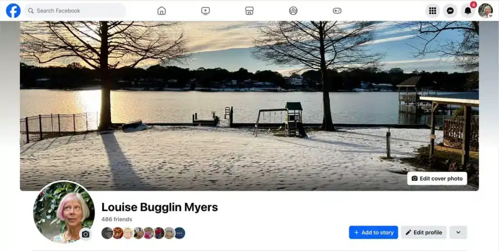
Same photo, two different display areas.
Keep anything you really want people to see, like faces, text, or logos, closer to the center. The edges are better for background details you can afford to lose if Facebook crops them.
Business Page cover photo
Facebook Pages use the same 851 × 315 pixel cover size as personal profiles.

What changes is everything around the cover. Your profile picture, Page information, and buttons all sit close to the design, so keep them in mind when deciding where your main message goes.
If you’re using your Facebook cover photo to highlight a product, campaign, event, or offer, make that the obvious focus rather than trying to fit several messages into the same space.
Facebook Group cover photo
Facebook Groups use a larger 1640 × 856 pixel cover with a 1.91:1 aspect ratio.
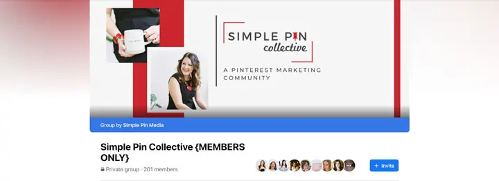
There’s more room here, but you don’t have to fill all of it. Keep the Group name or main message easy to find and read, with some breathing room around anything important.
If your team changes the cover often, save a photo template with the important areas already marked. You can then swap in new photos, text, or designs without starting from scratch each time.
Facebook Event cover photo
For Facebook Events, use 1920 × 1005 pixels at roughly 1.91:1.
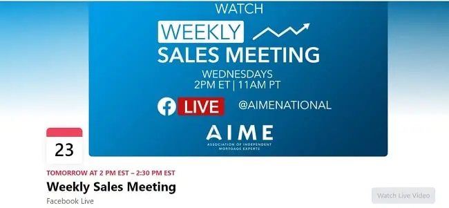
More space doesn’t mean you need more information. You don’t have to squeeze the date, time, location, speaker, CTA, and every other event detail into the cover when Facebook already has places for most of that.
Use the cover to highlight the speaker, venue, product, or theme instead. Once it’s uploaded, check it on desktop and your phone to make sure the important parts are still showing.
Why Facebook shows your cover photo differently on desktop and mobile
Here’s where Facebook cover sizing gets weird.
A Page cover displays at around 820 × 312 pixels on desktop and 640 × 360 pixels on mobile. Facebook doesn’t simply shrink the same image when someone switches from a laptop to their phone. It crops the cover to fit the available space, which means different parts of your design can disappear depending on the screen.
You can see the problem in the proportions alone. Desktop gives you a long, narrow space, while mobile gives you something shorter and taller. A headline that fits nicely across the desktop version can suddenly lose its first or last few words on mobile.
That’s why you should design for the safe zone, not just the full Facebook cover photo size.
The Facebook cover safe zone explained
Think of the middle of your cover as the space that has to do the actual work.
As a practical guide, use the middle 640 pixels for anything people need to see. Keep your headline, logo, faces, products, CTA copy, or other essential graphics within this area rather than spreading them across the full width of the design.
Keep inside the safe zone:
- Headlines and important text
- Logos and brand names
- Faces
- Products or product screenshots
- Offers, prices, or dates people need to read
- CTA copy
The outer areas can do a different job. Use them for background photography, gradients, patterns, textures, illustrations, or decorative graphics that still look fine if Facebook cuts part of them off.
For example, if you’re using a photo of a person, keep their face closer to the middle while allowing the background to extend to the edges. If you’re showing an app, keep the important part of the phone or interface central while letting supporting graphics sit further out.
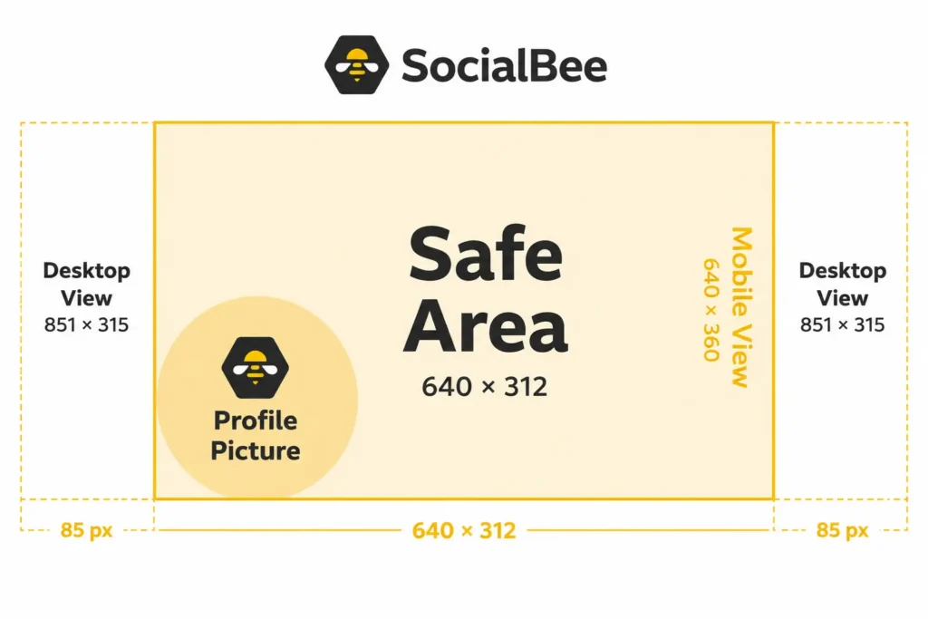
Also pay attention to the bottom of the cover. Avoid putting anything essential in roughly the bottom 30% of the image, particularly toward the left, where your profile picture and other Facebook elements can compete with the design.
A good way to check your layout is to ask: if Facebook removed the edges and part of the bottom of this image, would the message still make sense?
File format and compression: what Facebook does to your upload
Getting the Facebook cover photo size right doesn’t automatically mean the finished image will look crisp once you upload it.
Facebook processes and compresses images, so the file you export isn’t necessarily the exact file people end up seeing on your Page. Your starting image, file format, color setting, and how many times the image has already been saved or compressed can all affect the final quality.
Meta recommends an sRGB JPG at 851 × 315 pixels and under 100 KB for fast-loading Page covers. But JPG isn’t automatically the best choice for every design.
A simple rule to follow:
- Mostly photography → JPG
- Lots of text or logos → PNG
- Photography + a small amount of text → start with JPG and check the result
- Fine graphics or text looking fuzzy → try PNG instead
For covers built around photography, an sRGB JPG usually gives you a good balance between image quality and file size. If your design relies heavily on logos, typography, illustrations, or other elements with sharp edges, PNG or PNG-24 may keep those details looking cleaner.
Whichever format you choose, export in sRGB. It’s the safest option for keeping your colors predictable once the image is showing on Facebook and across different screens.
And start with a high-quality image. If the original photo is already small or blurry, changing the export settings won’t suddenly make it sharp. It’s better to resize a large image down than stretch a small one up.
Always go back to your original design
If you need to change your cover later, don’t download the current version from Facebook, edit it, and upload it again.
It’s a bit like photocopying a photocopy. Facebook has already processed the first image, and when you download, edit, save, and upload that version again, you’re working from something that may have already lost quality.
Keep the original Canva, Figma, Photoshop, or other design file and export a fresh copy whenever you make an update.
That also makes it much easier to change a date, headline, product, or campaign without rebuilding your cover from scratch.
How to design a Facebook cover photo that works across devices
You don’t need a complicated setup to make a Facebook cover photo that works on desktop and mobile. You just need to account for the crop while you’re designing rather than discovering it after you upload.
Here’s a practical workflow you can use in Canva, Adobe Express, Figma, or another design app:
- Start with the right canvas size. Choose the dimensions for the actual surface you’re designing for: profile, Page, Group, or Event. For a Facebook Page, start with the recommended 851 × 315 pixels rather than trying to adapt a generic social media graphic later.
- Mark your safe area. Add temporary guides around the middle 640 pixels of the design. Keep the headline, logo, faces, products, and anything else that absolutely needs to stay visible within that area.
- Choose your main message. Decide what someone should understand from the cover in a couple of seconds. If your headline is getting long, see if you can bring the primary message down to around three words and move the details somewhere else on the Page.
- Build outward from the important content. Once the essentials are in place, use the edges for photography, gradients, patterns, or decorative graphics. These are the elements you can afford to lose when Facebook crops the image.
- Leave room around the bottom and left side. Your profile picture and Facebook’s Page controls become part of the layout once the cover is live. Avoid putting important information in the bottom 30% of the design, particularly toward the left.
- Zoom out before you export. Your design might look great while it fills your entire laptop screen, but that isn’t how people will see it. Make it smaller and check whether the headline, logo, and product are still obvious and easy to read.
- Look at the whole Page, not only the image. Your cover sits next to your profile picture, Page name, description, and CTA buttons. Check that they work together rather than repeating or competing with each other.
- Export from your master file. Use an sRGB JPG for photo-heavy covers or try PNG when text and logos need to stay particularly sharp. Save the editable master separately so you can return to it later.
- Upload it and check the real thing. Open your Page on both desktop and your phone. Look specifically at the edges, bottom of the image, headline, logo, faces, and any CTA copy. If something important is disappearing, move it further toward the middle and export again.
Using your cover photo as a branded content touchpoint
Your Facebook cover is prime branding space, so don’t treat it as something you design once and forget about.
Give it a job, then change that job when your priorities change.
Think of your cover as another slot in your social media content calendar:
What’s happening? | Put it on your cover |
🆕 Product launch | New product + short launch message |
🎟️ Upcoming event | Speaker, event theme, or registration CTA |
☀️ Seasonal sale | Seasonal creative + current offer |
📣 Major business update | One clear headline |
💤 Nothing to promote | Your evergreen brand message |
You don’t need to redesign your Facebook cover photo every week. But a launch, rebrand, important announcement, seasonal campaign, or major business update is a good reason to change it.
And when you do have a campaign cover, give it an expiration date.
If your Black Friday cover goes live on November 20, schedule your evergreen version to return when the promotion ends. Otherwise, “Black Friday starts now!” could still be greeting people in December.
Keep the message short
A cover isn’t the place for a paragraph. People should understand the main message without stopping to read six lines of copy.
As a rule of thumb, see if you can get your primary message down to around three words. You can add a short supporting line or CTA when you need one, but the headline should do most of the work.
Facebook already gives you the rest of the Page for details.
Make the cover and profile picture feel like they belong together
Whatever you’re promoting, keep the branding consistent across your profile picture and cover.
You don’t need to copy the exact same design. Instead, carry over one or two visual cues, such as your colors, typography, photography style, background, or lighting.
If you’re using AI-generated headshots for a polished profile image, for example, you could use similar background tones or lighting in the cover.
And use high-quality images. A blurry or heavily compressed cover can make an otherwise professional social media profile look unfinished.
Think coordinated, not copied.
Facebook cover photo examples
There’s no single Facebook cover photo template that every brand should follow. A software company has different things to show than a streaming platform, and a product launch needs a different cover than an evergreen company Page.
The useful part is looking at what each brand decided was important enough to keep, and what they were happy to let disappear.
Here are four different approaches:
- SocialBee: Design around the safe zone and let decorative elements get cropped.
- SoFi: Use the cover to show what your product actually looks like.
- Apple: Keep the message short and give one thing most of the attention.
- Disney+: Treat the cover as part of a bigger campaign across the whole Page.
SocialBee: Decide what can afford to disappear
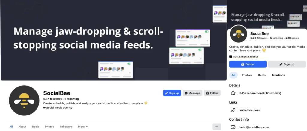
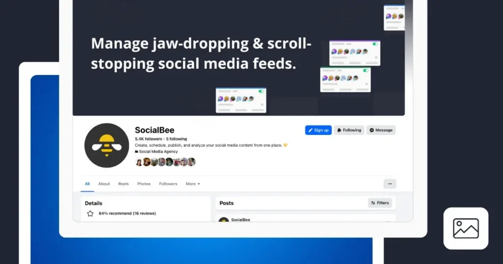
SocialBee’s cover is a good example of accepting that Facebook crops images differently on desktop and mobile rather than trying to make every single element survive both.
On desktop, more of the surrounding social media graphics are showing. Open the same Page on a phone and some of them disappear. But the cover still works because those graphics aren’t carrying the message.
The headline is.
That distinction is worth making before you even start designing. Not everything in your cover needs to sit safely in the middle. If you do that, you can end up with a cramped design surrounded by lots of empty space. Instead, decide what Facebook is allowed to crop.
The important note: Your headline, logo, product, faces, and CTA should stay within the safe area. Background graphics, patterns, photography, or other decorative elements can stretch beyond it.
A simple way to think about the hierarchy is:
Headline → essential
Supporting visual → useful
Decorative graphics → expendable
If the third one disappears on someone’s phone, nothing important has been lost.
SoFi: Show people what the product actually looks like
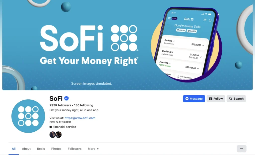
SoFi uses its Facebook cover photo to make a fairly broad product easier to understand. Instead of listing banking, credit, investing, loans, insurance, and everything else in a long headline, it puts the app itself in the middle of the design.
The phone becomes the explanation.
That works particularly well for apps, SaaS products, dashboards, platforms, and other services that are otherwise difficult to represent visually. If your product exists mostly behind a login screen, your cover is one place where you can actually show people what they’ll get.
It also saves you from trying to turn the cover into a list of features.
The important note: Before adding another sentence to your cover, ask whether you could show the same thing instead.
A phone mockup, screenshot, interface, product photo, or even one recognisable feature can often communicate the point faster than copy. Just make sure the important part of that visual stays within the safe zone, especially if people need to be able to read something on the screen.
For SoFi, one screen quickly shows the breadth of its offering, from everyday banking to a personal loan for medical expenses.
Apple: Give people one obvious thing to notice
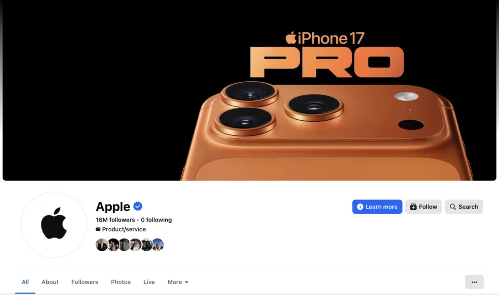
Apple’s cover does very little, which is exactly why it works.
There’s one product, one product name, and no second headline fighting for attention. The iPhone itself is oversized and allowed to run beyond the edges of the cover. If Facebook crops part of it on a different screen, you still know exactly what you’re looking at.
The part that absolutely needs to survive, “iPhone 17 Pro,” stays clear and easy to read.
This is also a good reminder that the safe zone doesn’t mean every graphic has to fit neatly inside an invisible box. Large, recognisable objects can extend beyond it. What matters is whether cropping them changes the meaning.
The important note: Decide what you want someone to notice first, then make everything else support it.
For the primary message, shorter is usually better. Try getting it down to around three words before adding more copy. You can always use the Page description, CTA button, pinned post, or another part of your social media profile for the details.
And don’t fill empty space simply because it’s there. Space can be part of the design too.
Disney+:Make the whole Page match the campaign
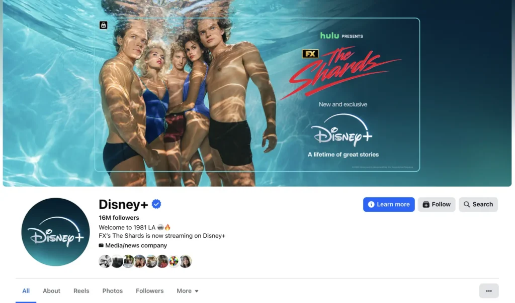
Disney+ takes a different approach and gives the cover over to whatever it wants people to care about right now.
In this example, that’s The Shards, which premiered on the platform in August 2026. But the interesting part isn’t only that the show appears in the cover. The rest of the Facebook Page supports the same message.
The Page description promotes the show, while the Learn More button gives people a clear next step. The cover gets their attention, and the rest of the Page takes over from there.
That’s a much better way to use campaign covers than trying to fit the entire campaign into one image.
The important note: When you change your Facebook cover photo for a launch, event, sale, rebrand, or major business update, check the rest of the Page at the same time.
Look at your profile picture, bio, CTA button, pinned content, and links. If your cover says one thing while everything underneath it is still promoting something from three months ago, the Page starts to feel disconnected.
And remember to change it back. A campaign cover should have an end date just like any other piece in your social media content calendar.
The four examples use the space very differently, but they all make the same basic decision before anything else: what does someone need to notice here?
Once you know that, deciding what stays in the safe zone, what can be cropped, and what doesn’t need to be on the cover at all becomes much easier.
Common mistakes and how to fix them
Even with the right Facebook cover photo size, things can look a little off once you upload the final design. Most problems come down to sizing, cropping, or image quality.
If something doesn’t look right, here’s what to check:
- Your cover looks stretched: The aspect ratio is probably wrong. Don’t force a square or portrait photo into a wide Facebook cover. Start with the right dimensions or crop the image to fit the layout.
- Your JPG keeps losing quality: Facebook compresses images when you upload them. Always go back to your original design and export a fresh file instead of downloading your current cover, editing it, and uploading it again.
- Your image looks blurry: Check the resolution of the original photo. Making a small image bigger won’t add detail, so start with a high-resolution file and resize it down if needed.
- Your headline gets chopped off: Move important text, logos, faces, and CTAs further toward the center. What looks perfectly placed on desktop might sit outside the safe area on a phone.
- Your colors look different after upload: Save and export your design in sRGB. It’s the safest setting for keeping colors more consistent across Facebook and other social media platforms.
- Something important disappears on mobile: Don’t design only around the desktop preview. Leave some space around anything people need to see and check the finished cover on both desktop and mobile.
- Your cover feels too busy: Give it one main job. If you’re trying to show a product, promotion, tagline, CTA, and five other things at once, removing something will probably improve the design more than moving everything around.
The simplest way to avoid most of these problems is to start with the right dimensions, keep the important stuff central, and check the final cover photo on more than one screen before you leave it live.
Frequently asked questions
What is the ideal Facebook cover photo size for a business Page in 2026?
The recommended Facebook cover photo size for a business Page is 851 × 315 pixels. However, using the right dimensions doesn’t guarantee that your entire design will appear exactly the same on every device.
Facebook displays cover photos differently on desktop and mobile, so keep important text, logos, faces, and other key elements toward the center of your design. Use the outer edges for backgrounds, patterns, or decorative elements that can be cropped without changing the message. Before you upload your cover, check how the final layout looks on both desktop and your phone.
How can I prevent a pixelated Facebook cover photo?
To prevent a pixelated Facebook cover photo, upload a high-resolution image with the correct Facebook cover photo dimensions. Use a high-quality JPG for photographs or a PNG file for graphics and logos. Avoid repeatedly resizing or compressing the image, as this can reduce pixel density and make important details appear blurry across desktop and mobile devices.
How can I make a Facebook cover image display correctly on mobile devices?
To make a Facebook cover image display correctly, design it for both desktop and mobile users. Facebook may automatically crop the image depending on the screen size, so keep important text, logos, and other critical content within the center portion. Preview your Facebook banner on multiple devices before publishing to prevent awkward cropping and ensure optimal display.
Where should I place my logo and text on a Facebook business page cover photo?
For a Facebook business page, place your logo, headline, and clear call to action in the central area of the cover image. Avoid placing text near the bottom left corner, where the profile picture may overlap important details. Keeping essential elements away from the left and right sides also helps maintain brand consistency across desktop and mobile displays.
What is the best way to create a Facebook cover photo with the correct dimensions?
The easiest way is to use a design tool with pre-sized templates for Facebook cover photos. Start by selecting the correct dimensions for your profile, business page, group, or event page. Maintain the appropriate aspect ratio, use consistent brand colors, and check the final upload size and maximum file size. Finally, preview the image on desktop and mobile to confirm that it displays correctly without unwanted cropping.
How can I make my Facebook cover photo stand out without distracting from my profile picture?
Create a visual hierarchy by using one strong image, a concise headline, and colors that reinforce your brand identity. On a Facebook business page, your cover photo should complement your profile picture rather than compete with it. Keep key information away from areas where the profile picture overlapping the cover could obscure details. Test the design on desktop and mobile devices to ensure the overall layout remains balanced.
Why does my Facebook cover image look different after uploading it?
Facebook may resize, compress, or crop your Facebook cover image to fit different screen layouts. A design that looks perfect on desktop displays may lose important details when viewed by mobile users. To avoid a pixelated Facebook cover photo, export your design at a suitable resolution and maintain the correct aspect ratio. Before publishing, review the image on multiple devices and make adjustments if text, logos, or other essential elements no longer display correctly.
Can you use a video as a Facebook Page cover photo?
No. Facebook doesn’t currently support videos as Page covers in 2026. Your Facebook Page cover needs to be a static image.
If you want your Page to feel more dynamic, use the cover to highlight your latest campaign, product, event, or announcement instead. You can update the design regularly so people visiting your social media profile see something current rather than the same evergreen image for years.
Does the Facebook cover photo size differ for Groups and Events?
Yes. There isn’t one Facebook cover photo size that works perfectly everywhere. The recommended dimensions depend on whether you’re creating a cover for a personal profile, business Page, Group, or Event.
For Facebook Groups, use 1640 × 856 pixels. For Facebook Events, 1920 × 1005 pixels is a widely used recommendation. Both have an aspect ratio of approximately 1.91:1.
Whichever format you’re designing for, leave some room around important text, logos, and photos. Facebook may crop parts of the image depending on the device and layout, so always check the finished cover after uploading it.
Get your Facebook cover right every time
A good Facebook cover photo doesn’t need to say everything about your brand. It needs to make the right thing obvious, whether someone lands on your Page from their laptop or their phone.
Start with the right Facebook cover photo size, keep the things that matter inside the safe zone, and give the design one clear job. Everything else can support that message or, in the case of those crop-prone edges, disappear without taking anything important with it.
The formula is pretty simple:
Right size → safe zone → one clear message → desktop + mobile check.
And don’t let your cover become part of the furniture. If you have a new product, campaign, event, offer, or major update, that space is already there and people are already seeing it. Use it. Then change it again when that message is no longer relevant.
Your Facebook cover is only one part of keeping your social media presence current, though. The posts underneath it need some attention too.
Ready to take care of those?
Start your 14-day SocialBee free trial to create, schedule, and manage your social media content in one place.