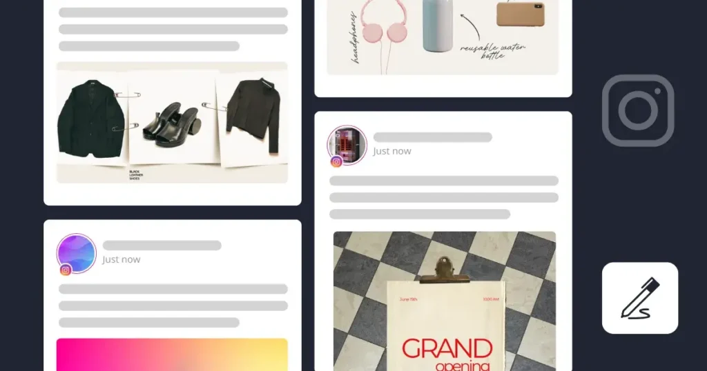
We’ve all heard the phrase: “You dress to impress.” But what if you could apply that philosophy to your Instagram? Imagine you’re meeting a business partner—you’re choosing an outfit that’s elegant, simple, a palette of blacks, grays, and whites. A picture of professionalism, wouldn’t you say?
Now, think of translating this sense of style into your Instagram aesthetic. Is it a curated grid of black-and-white photos? Or maybe something more timeless and classic, like a vintage theme?
When you visit an Instagram Business profile, the overall aesthetic is often what grabs your attention first. Your visual style sets the tone and determines how your audience will perceive your brand.
Let’s explore some creative themes and ideas to help you build a standout Instagram aesthetic. Are you ready to start crafting a feed that truly reflects your brand?
Short Summary
- Your Instagram aesthetic is key to how people see your brand, so make sure it matches your brand’s vibe and speaks to what your audience cares about to keep them interested and following.
- Once your brand identity and audience are clearly defined, it’s time to create a consistent Instagram theme using carefully selected imagery, typography, and colors that align with your brand.
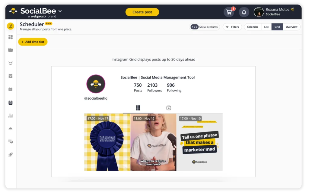
- Using SocialBee to plan your posts helps you maintain a consistent Instagram aesthetic by letting you see how your entire grid will look with your scheduled content, making it easier to create a cohesive feed.
- Your Instagram bio, though limited in space, is key to reflecting your brand, whether through creative use of emojis, minimalistic design, or unique fonts to stand out.
- Both Instagram Stories and Highlights are essential for maintaining a cohesive brand presence, as they extend your visual identity beyond your main feed; design on-brand covers for your Highlights and use templates for Stories to maintain consistency.
- While Instagram captions aren’t purely visual, they contribute to your overall aesthetic. Create a sense of consistency by structuring them similarly across posts, using emojis, spacing, and even custom fonts.
- Individual posts should be visually compelling and consistent with your brand’s aesthetic, ensuring that each post stands strong on its own while aligning with your overall theme. Stick to on-brand colors and fonts and add logos and watermarks to your posts.
- When posting Instagram Reels, make sure their thumbnails match your grid aesthetic on both the posts and Reels grid; add custom thumbnails to your videos that feature your brand’s colors, fonts, and even logo.
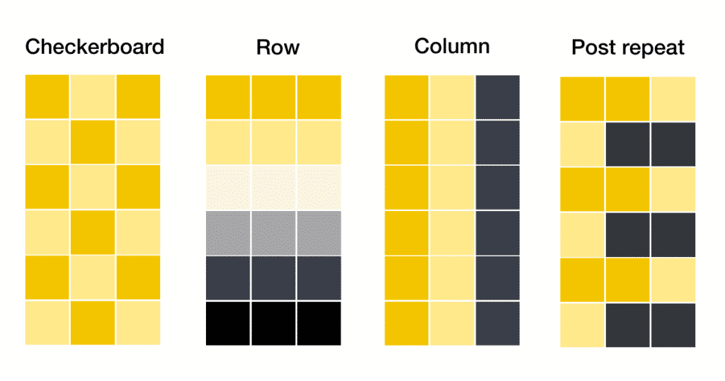
- Consider using structured layouts like checkerboard or row themes to organize your Instagram grid. In a checkerboard theme, posts alternate content or color, creating a checkered effect. In a row theme, each row follows a consistent style or color, giving your feed a cohesive look.
Why Is Your Instagram Aesthetic Important?
An appealing Instagram aesthetic helps with making your feed look more organized, attracting attention with a cohesive style, and subtly conveying your brand’s personality. It also makes scrolling through your feed a more enjoyable experience for viewers.
Obtaining a great Instagram aesthetic isn’t complicated, though. You can use colors, filters, or graphic elements to obtain a balanced, yet effective look. However, keep in mind that your Instagram aesthetic will be related to your brand’s vision, as well as the type of posts you want to add to your feed.
You will also need to take into account the Instagram image sizes to obtain harmonious Instagram feeds. Also, keep in mind that sometimes, words can speak louder than your images, cases in which Instagram captions make their way in. Your Instagram caption can also add up to your aesthetic, so don’t forget about it.
How to Make Your Instagram Aesthetic
Creating a cohesive Instagram aesthetic takes a bit of pre-planning.
Here’s how to create your Instagram aesthetic in 5 steps:
- Understand your audience.
- Establish your brand’s personality.
- Implement an Instagram theme.
- Be prepared.
- Use standard templates.
1. Understand Your Audience
Understanding your audience is essential when creating an Instagram theme because it helps you create content that resonates with your ideal followers. Start by asking yourself, “Who am I trying to connect with?” This clarity guides your content strategy, ensuring your visuals, messaging, and tone align with the interests and preferences of your target audience.
For instance, imagine you’re targeting fitness enthusiasts who are passionate about at-home workouts. Your content should reflect their lifestyle, focusing on workout routines, nutrition tips, and motivation. Knowing that your audience values convenience and consistency, you might design your posts to feature minimalistic home gym setups with easy-to-follow workout demonstrations.
Researching real user profiles that represent your target audience can provide valuable insights. By examining the accounts they follow and engage with, you can identify trends in Instagram aesthetics and content style that resonate with them.
2. Establish Your Brand Personality
Establishing your brand’s identity before creating an Instagram aesthetic is essential because it serves as the foundation for everything you create. It defines the core of who you are, your purpose, and how you want to connect with your audience. Without a clear identity, your content risks feeling scattered or inauthentic.
Think of your brand’s visual identity as if it were a person. How would you describe their personality? Are they warm and approachable, creative and unconventional, or maybe calm and serene? This personality will directly influence your choices in colors, fonts, and imagery, ensuring that everything aligns with the vibe and values you want to convey.
For example, if your brand speaks to an audience that values mindfulness and wellness, you might lean towards soothing colors and natural, earthy designs. Alternatively, if your brand is all about creativity and innovation, bold patterns and unexpected color combinations could reflect that dynamic energy.
3. Implement an Instagram Theme
With information about your brand and your audience now clearly outlined, it’s time to create your Instagram strategy and settle on a theme. Think about what imagery, typography, and consistent color scheme would best represent your brand aesthetic.
Remember to stick with a consistent Instagram theme throughout your entire account – we’re talking from your profile picture and bio to your Stories and feed!
Instagram Colors
One of the first elements you need to take into consideration to create an eye-catching Instagram theme is color. Colors can influence decisions, moods, and perceptions, which is why they shouldn’t be chosen randomly.
Your business has an overall personality. From values, tone, and message – they all create a bigger picture for the audience. Take a look at your brand’s logo first. What colors does it incorporate?
Is it a nice shade of pale pink that is also applied to the rest of your website? Bingo. You’ve just got what you need for your Instagram colors. You can create an eye-catching Instagram aesthetic by adding different shades of pink to your posts.
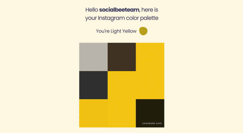
If you already have an Instagram theme and you’re looking for a tool to help you get a detailed color palette from your profile, Colorkuler works wonders. Here’s what SocialBee’s color palette looks like:
There could also be cases when your business doesn’t have a chosen color yet. In this situation, what you need to do is take a look at what your business promotes. If your business is concentrated on promoting vintage objects, for example, a brightly colored Instagram aesthetic might not work. However, golden, pale pink and white tones might do the trick.
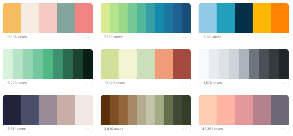
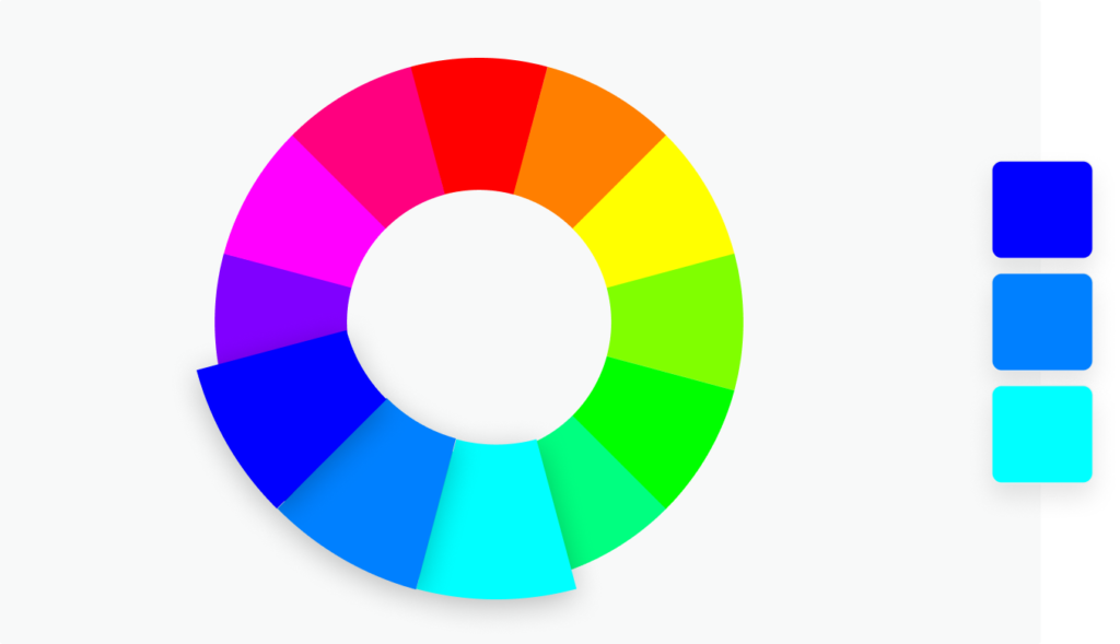
To get a cohesive look, choose a palette of two to five colors that fit well together. These could be complimentary, which means they’re high-contrast hues that lie opposite one another on the color wheel, or analogous, meaning they’re located on opposite sides of the color wheel. Choosing a primary hue and a few secondary hues to accentuate it is a common practice when designing an Instagram color scheme.
Typically, the primary color should dominate your design and be used for backgrounds or large elements, giving your feed its overall tone. Secondary colors are used more sparingly and work as accents to highlight certain elements, like important details or to break up the primary hue.
For text, choose colors that contrast well with the background to ensure readability. Darker shades of your primary or secondary colors are often used for fonts, especially against lighter backgrounds, while lighter shades can work well for fonts over darker backgrounds. Neutral tones, like whites, blacks, or grays, are also great for font colors as they tend to be versatile and easily readable across different backgrounds.
Typography/Fonts
Fonts bring together your graphic design and add to your brand’s aesthetic. The right fonts can reflect the personality of your brand, whether it’s modern, traditional, playful, or sophisticated.
When fonts are used consistently across your designs, they help build brand recognition. Over time, people begin to associate specific typography with your brand, making your content more recognizable even without your logo or other visual elements.
This consistency also enhances professionalism, as it ties together different design materials, from social media posts to packaging and advertisements, into one cohesive brand identity. Make sure to select a few fonts that work well together and make sense for your existing branding. The typography you work with should enhance your graphic design, capture attention, and be easy to read.
Composition
For square photos, centering your subject can be surprisingly effective. While traditional photography often advises against placing the subject in the center, doing so in square images can help your subject stand out and hold the viewer’s attention. This works especially well when the subject is strong enough to command focus, such as a striking portrait or a bold object.
Symmetry is another powerful tool in square compositions. By creating balance within the frame, symmetrical photos offer a clean and organized look that can be very visually satisfying.
The rule of thirds requires some adjustment when creating square posts. Instead of placing the subject at traditional intersections, you may find better results by positioning the subject closer to the edge of the frame. This can create a more dynamic composition and draw attention to the surrounding environment, giving your images a sense of depth.
Finally, leading lines are a great way to guide the viewer’s eye toward the main subject of your photo. In square compositions, this can be a bit more challenging due to limited space, but lines that draw attention from the foreground to the subject help create a sense of movement and depth.
Graphic Elements and Imagery
Professional-looking graphics and high-quality imagery will enhance the results of your Instagram strategy. Your profiles are more engaging when you use a good blend of photos and template-based graphics. Sometimes, depending on your business and budget, taking high-quality pictures yourself could be challenging. Stock photography can be used as long as it seems natural and is appropriate for the business.
Maintaining cohesion in your digital presence is also made easier by using consistent imagery. Applying a similar filter to every picture before sharing it is one of the simplest methods to make images look harmonious.
An appealing Instagram profile requires well-designed, professional social media visuals above all else. Users can only follow you or browse your website by visiting your profile. Your feed must be fantastic overall to leave the greatest impression.
Types of Content
The type of content you create plays a big role in what aesthetic you will put forward for your followers. Each category requires a unique visual style.
For example, in fashion, the aesthetic is often sleek and polished, with clean backgrounds and a focus on the outfit. Travel photography emphasizes vibrant, expansive shots that inspire adventure, often using consistent color tones to unify diverse landscapes. Food posts rely on bright, natural lighting and minimalistic backgrounds to highlight the dish, while lifestyle and wellness content often favors soft, earthy tones that evoke calm and balance.
Your niche and the interests of your followers should shape everything from fonts and colors to graphic elements and imagery. This way, there is no inconsistency between your aesthetic and the message you convey.
Instagram Filters / Editing
Instagram filters can make creating and sticking to an Instagram theme easier. Nowadays, Instagram offers an impressive number of filters that one can use. Thus, you can make your Instagram pictures go from vintage to new age in an instant. However, using multiple filters might take its toll on your Instagram aesthetic. Too many unrelated filters could create a less harmonious aesthetic.
Find the filter that works best for your Instagram pictures and stick to using it constantly. Just like with colors, you could blend in other similar filters, but make sure you don’t do that too often. Consistency is key when it comes to Instagram aesthetic ideas.
You can use the same filter or filters that don’t stray too far from the one you’ve chosen to create a simple, yet structured theme.
Or, you can use different filters that make your Instagram theme look vintage.
Editing photos is no sin – unless they feature a different edit each day. Stick to an editing style that won’t have you questioning the exposure, contrast, or brightness levels. If possible, use presets, or have a guideline to help you make the best of your Instagram pictures.
4. Plan and Schedule Your Content Ahead of Time
Planning your posts ahead is a game-changer when it comes to maintaining a consistent Instagram aesthetic. It gives you the power to curate your feed thoughtfully, ensuring that every post aligns with your brand’s look and feel.
By scheduling content in advance, you avoid the stress of last-minute posts that could disrupt your aesthetic. Instead, you can focus on creating a visually cohesive feed that keeps your audience engaged. Planning also allows you to mix up content types—like photos, videos, and graphics—while staying on brand.
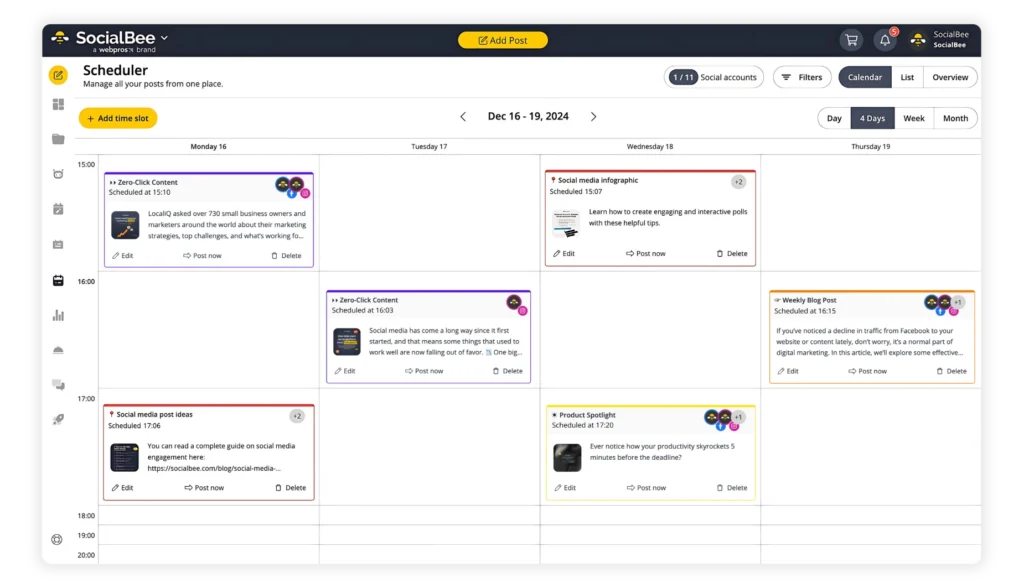
Use SocialBee‘s Content Calendar and Content Categories features to plan your posts with ease. By organizing your content into categories, you can create a balanced and consistent posting strategy. Then, set up your content schedule to automatically publish these categories at optimal times, ensuring your Instagram aesthetic stays cohesive and on-brand without the daily hassle.
5. Use Standard Templates
Developing social media image templates is a great strategy for maintaining brand consistency. Create an assortment of matching themes that are distinct enough to pique curiosity while still providing your profile with a unified appearance.
Think about the different types of posts you want to include in your strategy, such as quotes or client testimonials, and create templates that you can easily modify and use regularly. This will not only improve the consistency of your Instagram theme, but also save you the time you would normally spend brainstorming and creating new posts.
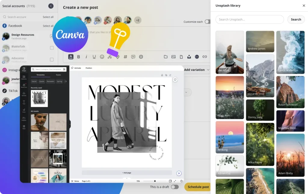
SocialBee makes it easy to open, preview, and import your Canva designs directly into your posts. You can bring in the visuals you’ve already created, organize them alongside your other content, and schedule everything from one place.
SocialBee’s Canva integration.
Instagram Aesthetic Ideas
A good Instagram profile maintains a consistent aesthetic from its profile picture and bio to Stories and the grid. We’ve created a list of all the elements of your Instagram account that need to follow your theme, paired with examples and ideas for each one:
- Instagram bio
- Instagram Stories
- Instagram Highlights
- Instagram captions
- Instagram individual posts
- Instagram Reels
- Instagram profile grid
1. Instagram Bio
This is perhaps the element of your profile where you have the least flexibility. However, that doesn’t mean it’s not important. Your Instagram bio is one of the first noticeable elements on your account, and there are ways to make it reflect your brand.
You can use emojis in varied ways. Add them to reflect the activity of your business, or perhaps as makeshift bullet points that organize your text. Alternatively, you can just keep it short and simple, sticking with a minimalistic theme.
Another fun thing to do is use an Instagram font generator to stick out of the crowd and bring an element of uniqueness
Instagram Bio Examples
Let’s look at some of the different bio options in action!
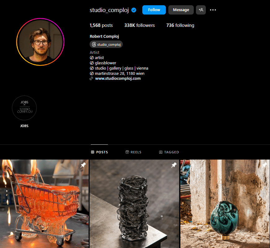
Robert Comploj found a great way to use emojis to not only organize his bio but also uniquely convey his work. Most likely this isn’t an emojis you’ve ever used or even seen. But for his profile, this emoji perfectly matches the unique lines created by melted glass.
Gavin Strange on the other hand went with well-known emojis that showcase his activity and grab attention. His bio is short and sweet, and just looking at the emojis can give you a pretty clear idea of what he is all about.
He also went with a unique font for his name, emphasizing his loud and outgoing online persona.
2. Instagram Stories
You can’t have a strong brand presence without Instagram Stories, therefore it’s important to make sure they match your overall design. The visual identity of your main feed and Stories should remain consistent, even while Stories provide a more informal and transient method to engage with your audience.
By being consistent, you can help your brand feel more coherent and increase its recognition. Furthermore, if your profile and Stories have a consistent aesthetic, it gives the impression of professionalism and refinement, which in turn can increase interaction and bring in new followers who value such attention to detail.
One great way to ensure that your Stories are always on-brand is to use templates. Create a few Story templates that are easily edited to fit whatever message you want to convey and keep them on hand. This way, you maintain your aesthetic while saving plenty of time on brainstorming and creating new content.
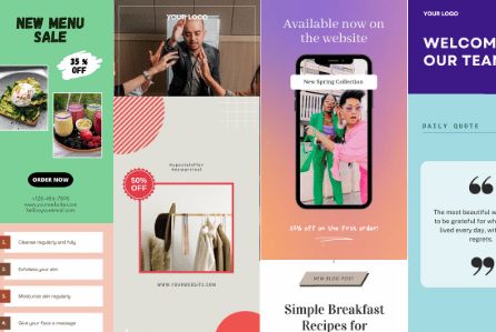
Instagram Stories Examples
For brands that know how to do social media right, it’s clear that Stories are an extension of their Instagram feed – a more fleeting and interactive form of communication, but one that needs to reflect the brand voice just the same.
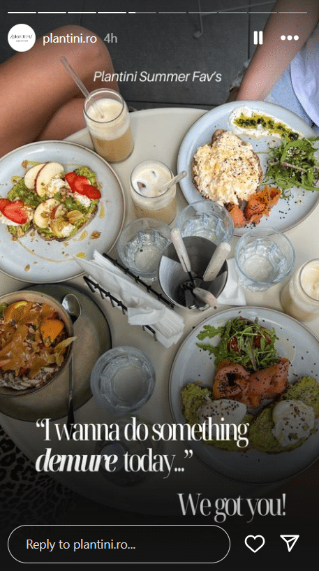
Plantini is a brunch place that knows its audience wants to see one thing – good food! They always post the latest images of their dishes on the story, and take advantage of the post’s expiration date to feature recent trends.
The food in their pictures has bright colors that stand out against the more minimal background, in this case, the gray plates, table, and even wall. The font used on the bottom of the Story is one typically used in print, which makes the image look like something out of a culinary magazine.
With how fast trends come and go these days, it’s good sometimes for your posts to come and go according to them, and Stories allow you to do that because they disappear.
One thing Stories are often used for is sharing links to the latest news, articles, and other important updates. Vogue always pairs their article links with one simple yet powerful image that describes what the article is all about:
By using strong images that capture attention and are relevant to the content you’re sharing, you increase the probability of your links getting the clicks you were aiming for. In this case, Oprah is the center of the picture, dressed in a purple jumpsuit that draws attention. The button with the call to action also stands out with a white background over the mostly blue and purple image.
3. Instagram Highlights
Instagram Highlight covers are a powerful yet simple way to give your profile that extra pop—while also reinforcing your brand’s aesthetic. These little icons are one of the first things people see when they visit your profile, so making sure they align with your overall look is crucial.
The secret to creating effective Highlight covers? Keep them clean and minimal. Since they appear small on the screen, bold yet simple designs work best. This not only enhances your profile’s visual appeal but also ties your aesthetic together seamlessly, making your brand feel cohesive and professional at first glance.
Instagram Highlights Examples
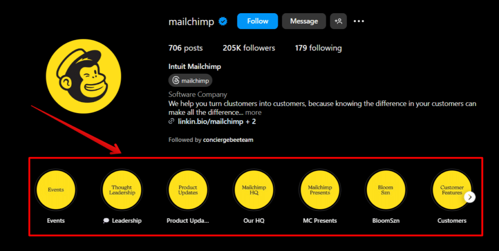
Mailchimp took “clean and minimal” and ran with it to its full extent. Their Highlight covers perfectly match their profile picture – plain on-brand yellow background with minimal writing in the brand font. Not only do they perfectly match the aesthetic, but it’s clear to understand what each Highlight is about.
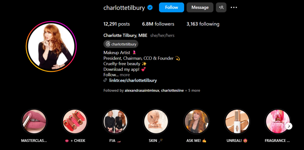
Charlotte Tilbury took less of a minimalistic approach with her Highlight covers and used different pictures for each Highlight. However, the overall look is still cohesive. The images represent make-up, perfume, or Charlotte herself according to the theme of each Highlight, and the color palette ties in beautifully with her brand’s aesthetic.
Whether the covers used are plain or more intricate and colorful, there are two important rules: they should be representative of the brand and the topic of the Highlight.
4. Instagram Captions
While captions do not fall under the category of visual aesthetics necessarily, they do still contribute to the overall theme of your account. When your images have captions that are all similarly structured, they create a sense of consistency that enhances your Instagram aesthetic.
Watch our video below to learn more tips and tricks for writing catchy captions.
Instagram Captions Examples
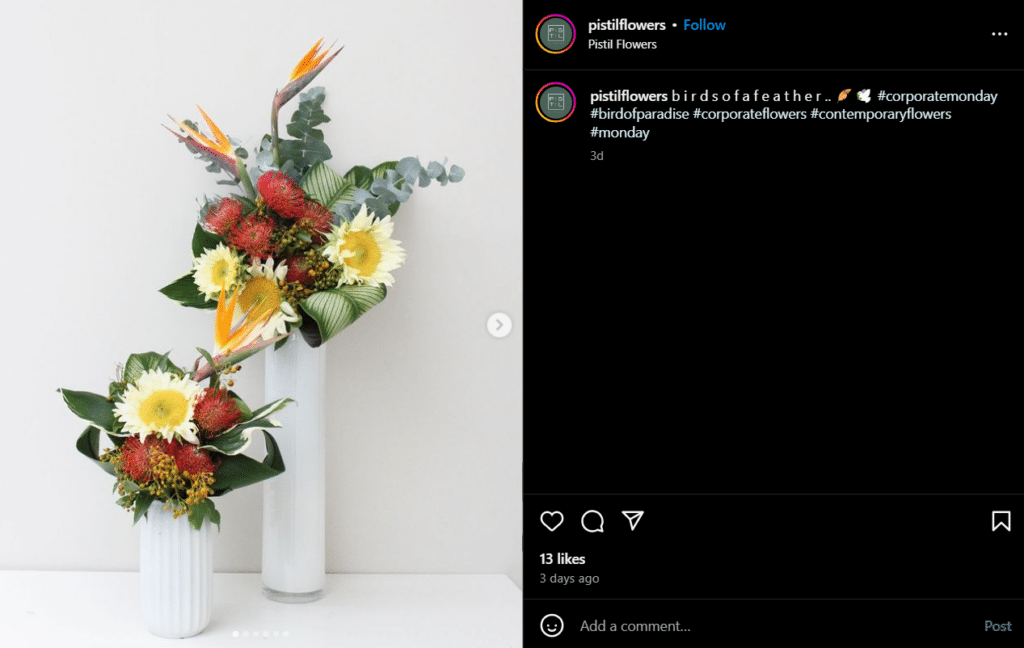
Pistil Flowers has a minimalist Instagram aesthetic, showcasing their plants with pictures with simple backgrounds that contrast the vivid colors of flowers. To match this aesthetic, they play with spacing in their caption – all of their posts have the same spacing between letters in a one-word caption, paired with one representative emoji.
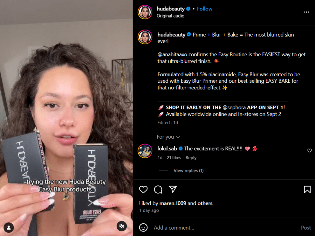
Huda Beauty has a lot to say about their products in their captions. To keep things organized and easy to follow, the brand uses spacing and horizontal lines to clearly separate each piece of information and make it easily discernable from the rest of the caption.
This not only makes the caption look better, but also ensures that their call to action stands out and urges as many people as possible to make a purchase.
5. Instagram Individual Posts
When people are scrolling through their timeline, they won’t be greeted by your entire account – instead, they’ll occasionally see some of your individual posts. Just like you have to think about both individual Stories and Highlight covers, you also have to carefully create both your grid (which we will talk about next) and each post.
Don’t create your Instagram content with the sole purpose of it looking nice grouped with the rest of your posts. Also ensure each post has the right colors, fonts, and conveys a clear and interesting message.
Instagram Individual Posts Examples
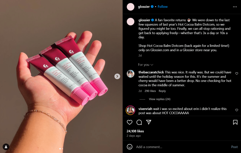
Glossier is well-known for having a strong Instagram aesthetic. Their posts are notoriously minimalistic and clean, and they showcase their products in a way that highlights simplicity and the beauty of every-day life. If a post on your timeline is from Glossier, you’ll know it right away.
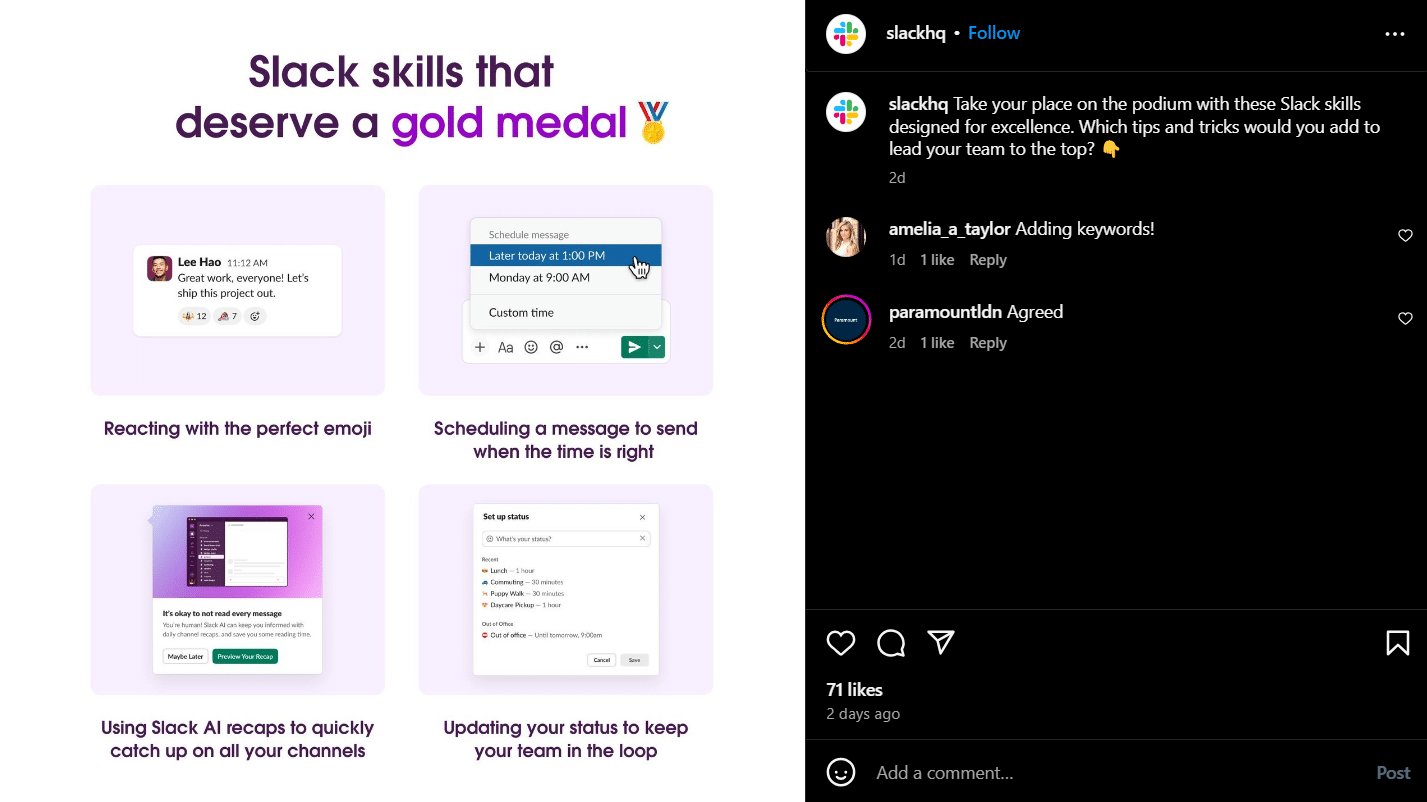
One look is also all you need to distinguish a post from Slack. That is because they cleverly use their brand colors, font, and imagery in every visual to make it easily recognizable and familiar.
Sticking to your brand’s aesthetic is all about consistency, so when you create Instagram posts, it’s best to follow a clearly outlined brand guide.
6. Instagram Reels
Reels are an important part of your Instagram strategy and, therefore, your aesthetic too. When you post a Reel, it becomes part of two grids: your posts grid, and your Reels grid. The part that shows on both grids is called a thumbnail and is practically the cover of your video.
To make sure these thumbnails fit your Instagram aesthetic, they must:
- Look cohesive on the Reels grid, where it will show in its original portrait-orientation format.
- Look good among your static visuals on your posts grid, where it will be cut into a square automatically by Instagram.
Sometimes, your thumbnail can simply be a still from your video. Other times, you might need to add a separate image that is representative. Either way, the thumbnail must follow your brand guidelines on colors, fonts, and imagery.
SocialBee lets you enhance the visual appeal of your Instagram Reels by adding custom thumbnails directly through its platform. This feature ensures that each Reel grabs attention before the video even plays, allowing you to design a cohesive and branded look across your feed.
You can upload custom thumbnails to your Reels in the post editor, ensuring your content stays visually consistent and engaging. Whether you’re showcasing products or sharing behind-the-scenes clips, this feature helps your Reels stand out and maintain your aesthetic
Instagram Reels Examples
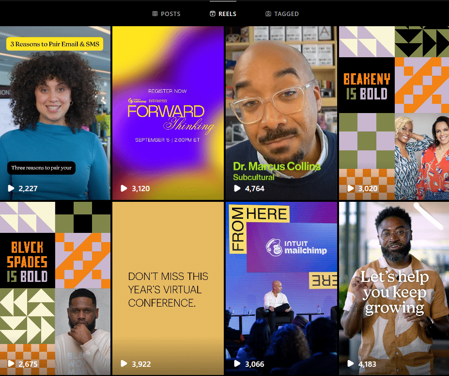
Let’s take a look at MailChimp again, this time their Reels thumbnails. Their Reels grid looks diverse yet cohesive; it features various people and multiple colors, and at first glance, you might be tempted to think there’s no theme.
In reality, nothing is unintentional about these thumbnails. The colors are bright and work well together to create a consistent aesthetic. You’ll notice even the colors and pattern on the shirt on the bottom right work well with the colors and patterns on the top right and bottom left posts. The fonts used, again diverse, are carefully matched to each type of video.
Switching over to the posts grid, the Reel thumbnails fit perfectly there too. They were designed so the text and images are not awkwardly cut off, and the colors and graphics match those of the static posts (in this case, the carousel post on the bottom middle).
7. Instagram Profile Grid
Randomly posting Instagram pictures or videos is a no-go if you want to obtain an attractive Instagram aesthetic. Let’s think about it for a second: your first post is a motivational quote. Your second post is a picture of a delicious poke bowl, and your third post is a person working out. Looking good, so far!
However, your next posts are of another person working out, and then you post a video. And maybe another picture of a poke bowl. Before it gets too repetitive, why not try a creative layout? There are many fantastic photo collage ideas that can enhance your Instagram aesthetic.
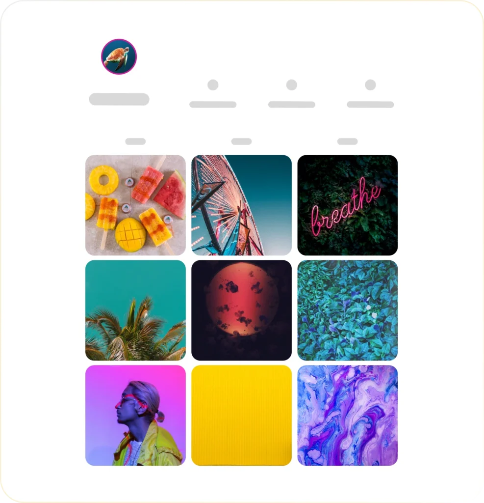
Your Instagram feed can be seen as a puzzle: every piece creates the final picture. And that’s why using a grid to create an aesthetic Instagram feed is a must. Let’s take a look at some of the grid examples you could use to make the best out of your Instagram feed:
- Checkerboard – the black and white board – the first post covers one theme, the second one covers a second theme, you repeat it.
- Row – all the pictures on the row are the same.
- Column – all the pictures on the column are the same.
- Post repeat (usually a 2-2-2 pattern) – two pictures of a kind, two pictures of another kind, two more pictures depicting something else.
These are a few of the grid examples you could use as part of your next Instagram aesthetic. If you’ve already decided on the Instagram aesthetic ideas you want to use, you might also want to take into consideration posting them.
Use SocialBee’s “Grid Preview” feature to perfect your Instagram aesthetic before you hit publish. This handy tool allows you to visualize how your upcoming posts will look together on your profile grid. By planning your content layout in advance, you can ensure your feed looks cohesive and visually balanced.
Visualize and plan your Instagram grid aesthetic in advance with SocialBee!
Instagram Profile Grid Examples
Now that we’ve looked at some ideas you could use, it’s time to get inspired by these Instagram themes:
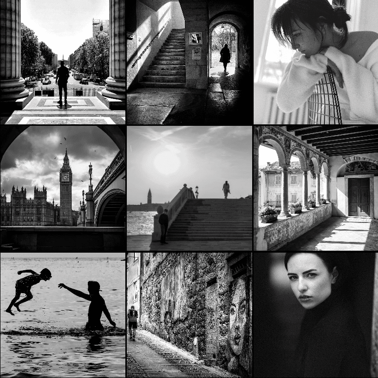
1. Black and White Theme
If you’re looking to attach the word “classy” to your Instagram theme, then the black and white theme is the best fit for you. Of course, classy isn’t the only word to define a black and white Instagram theme.
Choose a black and white Instagram theme if you’re looking for these effects:
- Elegant
- Gloomy
- Mysterious
- Sophisticated
You can go around this theme in two ways:
- You can choose to shoot in black and white directly (phones provide the mono, silvertone, or noir tones)
- You can choose to later add a black and white effect to your colored pictures. You can do that in apps such as VSCO, Photoshop, or any other photo editing program.
A black and white theme is suitable for an Instagram page that concentrates on:
- Portraits
- Urban landscapes
- Urban photography
Example: @b.n.w.photos
However, a black and white theme can work on any Instagram page, as long as the brand’s values are also in check with it.
2. Bright-Colored Theme
Bright colors are eye-catching and effective, as long as they’re in tune with your business, of course. This playful theme is the best for businesses that target young people or have a very specific product that needs this sort of theme.
Example: @biteable
When considering a bright-colored Instagram theme, keep these key elements in mind:
- Color association – if you’re going for that vacation vibe, go for colors such as blue, green, or orange.
- Structure – choose a grid for your pictures and stick to it – don’t randomly add pictures.
- Image editing – you can make your pictures even brighter by enhancing the colors in editing apps.
3. Vintage Theme
An Instagram theme that contains brown and natural colors forms a great vintage vibe. However, brown and natural tones aren’t the only ones to make up your vintage theme.
Example: @polly.florence
You can use the following elements to form your vintage theme:
- The grain effect (can be used in apps such as Photoshop)
- Apply filters (either Instagram filters or filters found on any photo editing app)
- Play around with photo settings – decreasing saturation, increasing the warmth, or adjusting the contrast could be some of the examples.
- Use brown tones, and take into consideration that you can also mix in some green or red tones.
Choosing the right content to match the vintage Instagram aesthetic is also important. Nature, travel, or portraits pair well with this kind of theme.
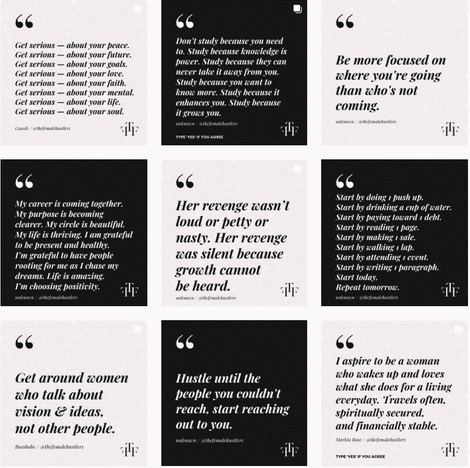
4. Checkerboard Theme
If you’re interested in adding an interesting structure to your Instagram page, there’s one example to look at. You could choose a checkerboard Instagram theme.
Just like in a game of chess, all your images are structured in a way that creates an alternating movement.
Example: @thefemalehustlers
You can use the following ideas to create a checkerboard theme:
- Alternate black-themed pictures with white-themed pictures to create the chessboard illusion.
- Use a quote on a background of your choice for every photo you’ve posted (you can choose the color of your brand’s logo, for example).
- You can also alternate filters or colors for every other post.
Frequently Asked Questions
To make your Instagram Stories more aesthetic, stick to your brand’s color palette, fonts, and overall visual style. Use consistent filters and design templates to create a polished look, and don’t be afraid to get creative with Instagram’s tools like stickers, GIFs, and text effects.
Apps like Canva or Unfold can help you design eye-catching, on-brand templates that elevate your Stories and keep your audience engaged.
To get aesthetic filters on Instagram, explore the Effects Gallery by swiping left in Stories and tapping “Browse Effects.” You can search for specific filters using keywords or follow creators who design popular aesthetic filters.
Once you find a filter you love, save it to your camera, and use it consistently to create a cohesive look across your Stories, keeping your Instagram aesthetic on point.
The most followed Instagram account is Instagram’s official account, boasting over 600 million followers. It showcases top creators, popular trends, and platform updates.
Among individuals, Cristiano Ronaldo holds the crown as the most followed person, with millions of fans from around the world. His account combines sports, lifestyle, and sponsored content, making him a global influencer both on and off the field.
He is followed in the top by Leo Messi, another sports personality who mostly posts sponsored content alongside promotional content for his hydration drink. Selena Gomez and Kylie Jenner come in third and fourth, both celebrities having made a name for themselves on TV.
Now, both women have started their own businesses in the beauty and fashion industries, which they feature on their accounts alongside glimpses into their personal lives.
Create Your Own Instagram Aesthetic
Finding that eye-catching Instagram aesthetic might sound like a lot of work, but the results will be worth it. Starting to work on your Instagram feed will be the hardest part. You might not know what colors, filters, structures, or themes to choose from at the beginning, but that’s alright. In the end, practice makes perfect, doesn’t it?
Yet, your business will be the one to dictate how your Instagram feed will look like. A black and white theme might not be the best choice for a brand that sells candy. Or, a colorful theme might not work best for a brand that has a collection of only black and white clothes.
SocialBee makes it easy to plan content ahead and maintain a consistent visual style. Import your images from Canva and preview your Instagram grid before posts go live. Try SocialBee’s 14-day free trial to enhance your Instagram feed without the hassle of remembering to post.


